One of the first things the Time Travel Guides website needed was a logo. The theme I chose for the website had space set aside for a site logo and I knew it would be useful in other places too, such as the profile pictures on social media accounts.

What is the TTGs Logo?
The logo for TTGs is a compass with clock hands. I chose this design because the site is about travelling through time as well as in space. The clock hands point to 20:21 because that is when the site was created.
How I Designed a Website Logo
Creating the logo took plenty of patience, but the process was actually quite straightforward. I had an idea of how I wanted the logo to look and although I considered some other options (such as abstract versions and simpler designs) while reading about logo design online, I kept coming back to my original idea. After playing around with different colours and experimenting with flat and 3D versions, I knew what I wanted to create. I just needed to find out how to make my own logo.
Using Inkscape to Make a Logo
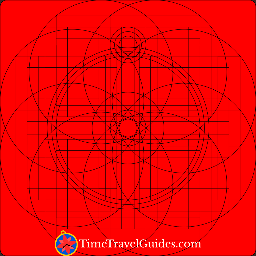
I used the free, open-source Inkscape to create my logo. The Inkscape website has some useful tutorials and there are plenty of people offering advice on using it online. I decided to follow a YouTube logo design tutorial based on the golden ratio as I wanted to create a balanced, symmetrical design. The process begins by creating a series of templates based on the Fibonacci sequence. Every part of the logo can be created by fitting together copies of these templates. The parts of the shapes that aren’t needed are then removed, leaving behind the logo.
Steps in Logo Design
 Template circles created using the golden ratio.
 The first version of the logo built from the circle templates.
 A more complicated version of the logo design.
 Inkscape tools were used to split the design into pieces.
 Individual pieces being removed from the logo design.
 Colours were added to the logo while the template lines were still in place.
 The template lines were removed and clock hands were added to finish the logo.
 The compass was tilted to give it a bit more character.
As this was my first attempt at creating a logo, everything ended up being a bit more complicated than it needed to be. I used a lot more shapes and guide lines than necessary to put my logo design together. The template method using the golden ratio can be used to replicate the design by fitting the same circles together, so I will be able to repeat the process more accurately and efficiently next time. However, the intermediate stages ended up looking rather impressive in their own way and I ended up with a usable logo design.


